HR Analytics Software for Data Visualization
HR Analytics software provides managers with real time data on an employee’s performance. This information allows managers or HODs to make informed decisions regarding how to best utilize their staff. An impactful way to present and communicate information is through Data visualization In today's world, organization can no longer succeed without the use of data. HR, in particular, uses analytics to drive talent, leadership, and hiring decisions for businesses. A well-designed visualization of your key HR data brings life and meaning to information that goes beyond what can be achieved with numbered or bulleted points in a presentation.
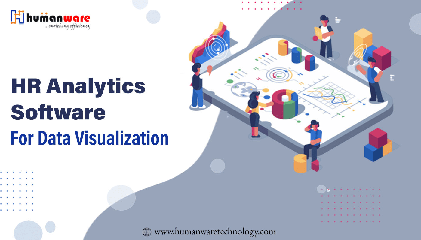
What is HR data visualization?
Today's world is increasingly data-driven, and to stay competitive in the business landscape, being able to visualize and understand data is more important than ever. Visualizing HR data is especially important when making HR decisions because we can no longer be guided by instinct or intuition. Data visualization can be defined as the representation of information and data presented in graphical form. To visualize data in an easy to understand way, the use of charts, maps, and graphs is used to understand patterns, trends, and outliers in your data. collected, but also provide a way to present data to non-technical people who need clarification.
Why is Data Visualization Important ?
HR specialists sometimes lack data visualization skills. However, data visualization offers HR professionals a tremendous opportunity to provide meaningful insights into the organization data. On a daily basis, you collect payroll and benefits data, employee engagement scores, feedback, and performance reviews. Additionally, you collect basic employee data such as name, address, phone number, assigned department, vacation days, sick days, special skills and qualifications, among many others. data points. And the larger the organization, the more data there is to accumulate. Visualization is the key to getting your message across when there is a lot of data. By using data visualization, you can increase the business impact of HR.
1. Data visualization for HR provides more meaningful insights and HR analytics into recruiting and talent management processes. HR can better understand things like productivity, compensation, and company culture to improve employee engagement.
2. Data visualization harnesses an individual's visual processing skills to visually explain large and complex volumes of data. This leads to more clarity on how to interpret the data you see.
3. Data allows HR to move from qualitative or “visceral” decision-making to more data-driven insights. As new data is explored, more data owners within the business are included in data analysis. Data visualization allows HR and different business departments to explore and identify the meaning of data.
4. You can easily share the insights you find in the data with decision makers who may not have the time or understanding to read raw datasets.
Types of Data Visualization Techniques
There are many different ways to visualize your data some of those techniques are :
- Charts such as line and bar charts are common techniques for visualizing your data. Charts are used to show trends or progress over time. You can also use them to compare many different related groups to each other. For example, employee turnover rate in different locations.
- Scatter Charts are useful in situations where you have so much data that it's hard to see a pattern quickly. They are particularly useful when you want to show relationships between two large data sets, such as headcount and manufacturing output.
- Pie Charts represent numbers in percentages and the sum total of all parts must equal 100%. You can use this system to easily view the number of applications received for a position and which job boards they come from.
- Heatmaps show the relationship between two elements and provide ranking information such as top to bottom with color indication. They are useful for spotting patterns and quickly analyzing trends.
- Matrix Charts help HR managers visualize and evaluate complex data relationships to make more informed decisions. You can use these diagrams to identify the source of problems, match requirements to specifications, or allocate resources as needed.
How to use HR Data Visualization
Using data visualization with recruiting visualization is easy to interpret and empowers your team to make data-driven decisions. For example, you can find out which job site brings in the most qualified candidates or the cost per hire. Many applicant tracking systems (ATS) already come with a reporting feature, but not all reporting tools have the same functionality, and many ATSs only provide the basics.Similar to turnover, you can visualize retention data to see why employees want to stay with your organization and what motivates them across different countries, departments, or even teams. Use this data to retain formal employees in your organization. There are many ways to use data visualization to increase productivity. For example, have your peers use flowcharts to visualize processes or mind maps when brainstorming the workforce. By using these graphical images into your process, your peers can save time and focus on the real challenges at hand. The best way to understand future trends is to look at the past data you've collected. Predictive analytics is the use of data analysis to make future predictions. If you track relevant data points, you can analyze areas such as hiring success or even revenue through employee engagement, which are closely related. Workforce planning is the process of analyzing your organization's current employees and anticipated business growth or changes to determine the steps your team needs to take to meet current and future hiring needs. It also examines the most efficient and cost-effective methods for recruiting and retaining talent. In addition, HR can also provide meaningful business insights and display connections or relationships between variables such as job satisfaction, employee engagement, engagement, motivation, and performance. Employees who are satisfied with their work are more likely to perform better than those who are not, and vice versa. Using these metrics can help you understand retention efforts and their results.
Conclusion
HR professionals must be able to visualize data in an easy-to-understand and effective way in today’s data-driven world. Your team should incorporate data visualization to help guide talent, leadership, and hiring decisions for your organization’s overall success. You can do this by defining the purpose of your graphics, understanding your audience, and identifying what data makes for the best visualizations. In your journey Humanware HRMS is there to help you with all your organizational needs.